
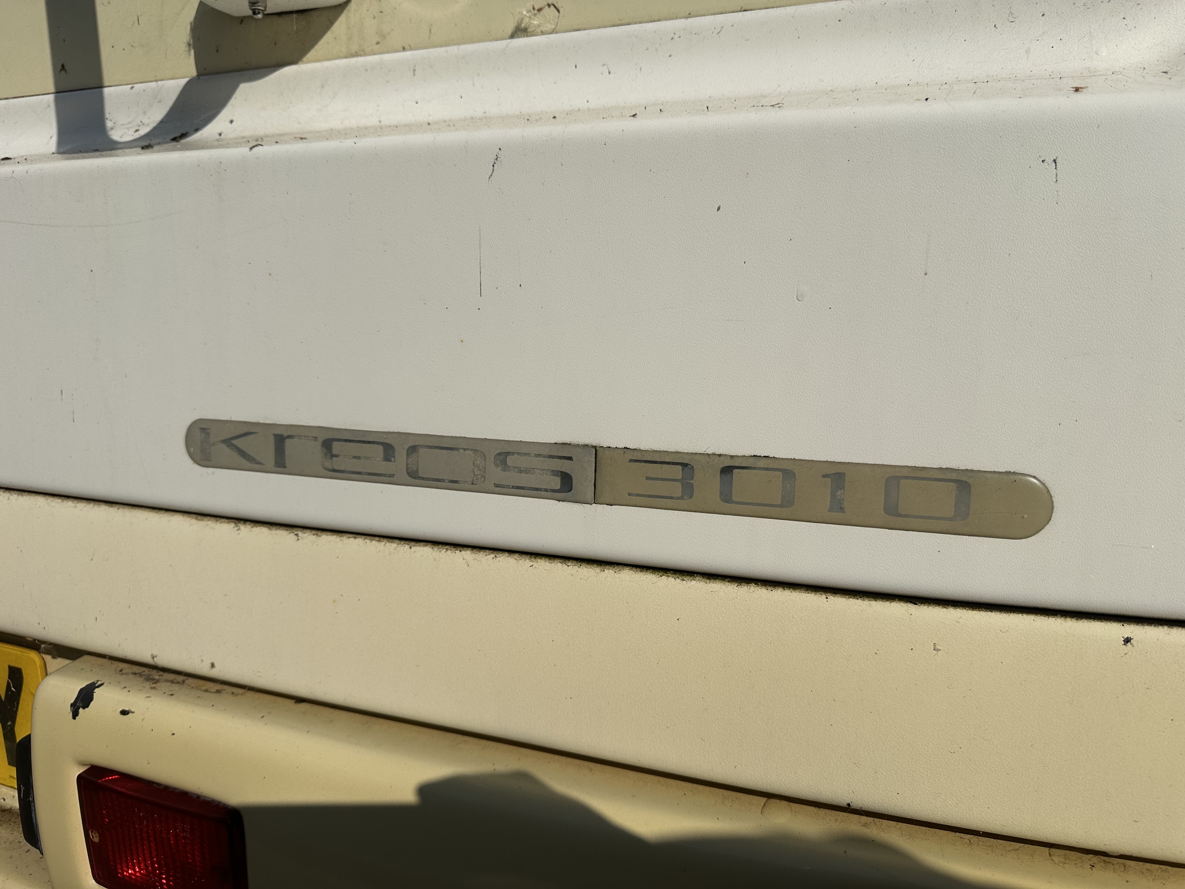
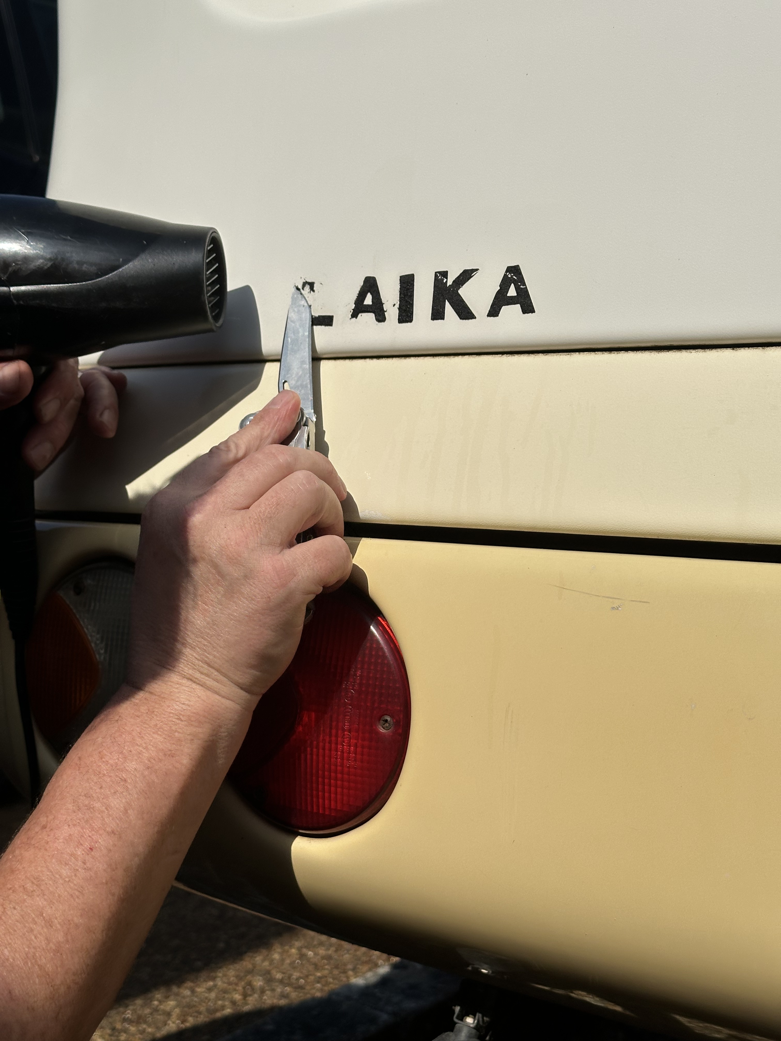
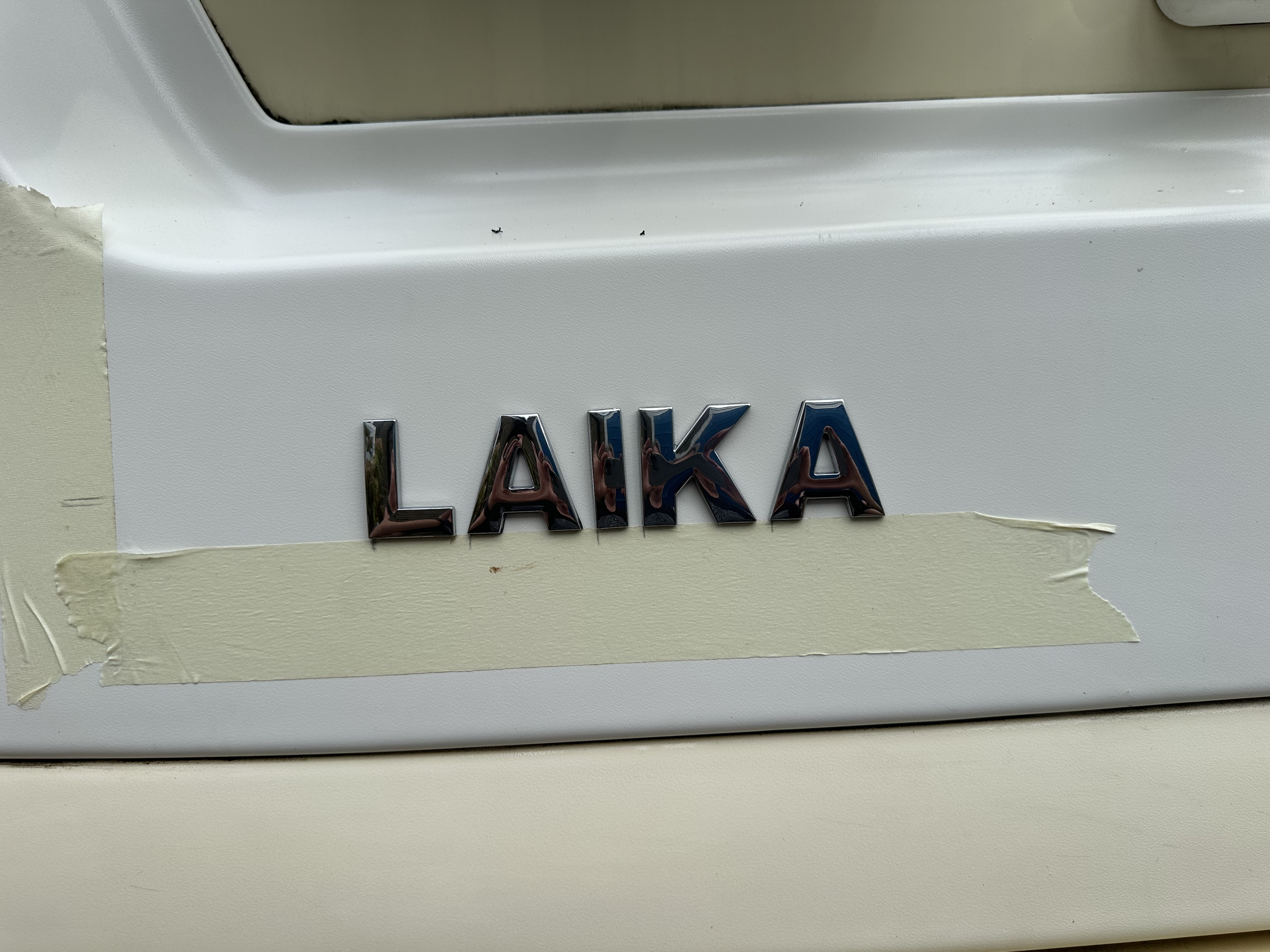
After some 20 odd years, some parts of Ziggy are looking – how does one say… Tired… and some parts are a bit shagged. Case in point – on the rear section of Ziggy were two graphics – one was LAIKA picked out in chrome letter, and the other was some weird kind of gel coated KREOS 3010 – that was actually in two parts too be honest. Either way, they looked awful k00 and a letter or two of LAIKA was missing – leaving just the glue to read….
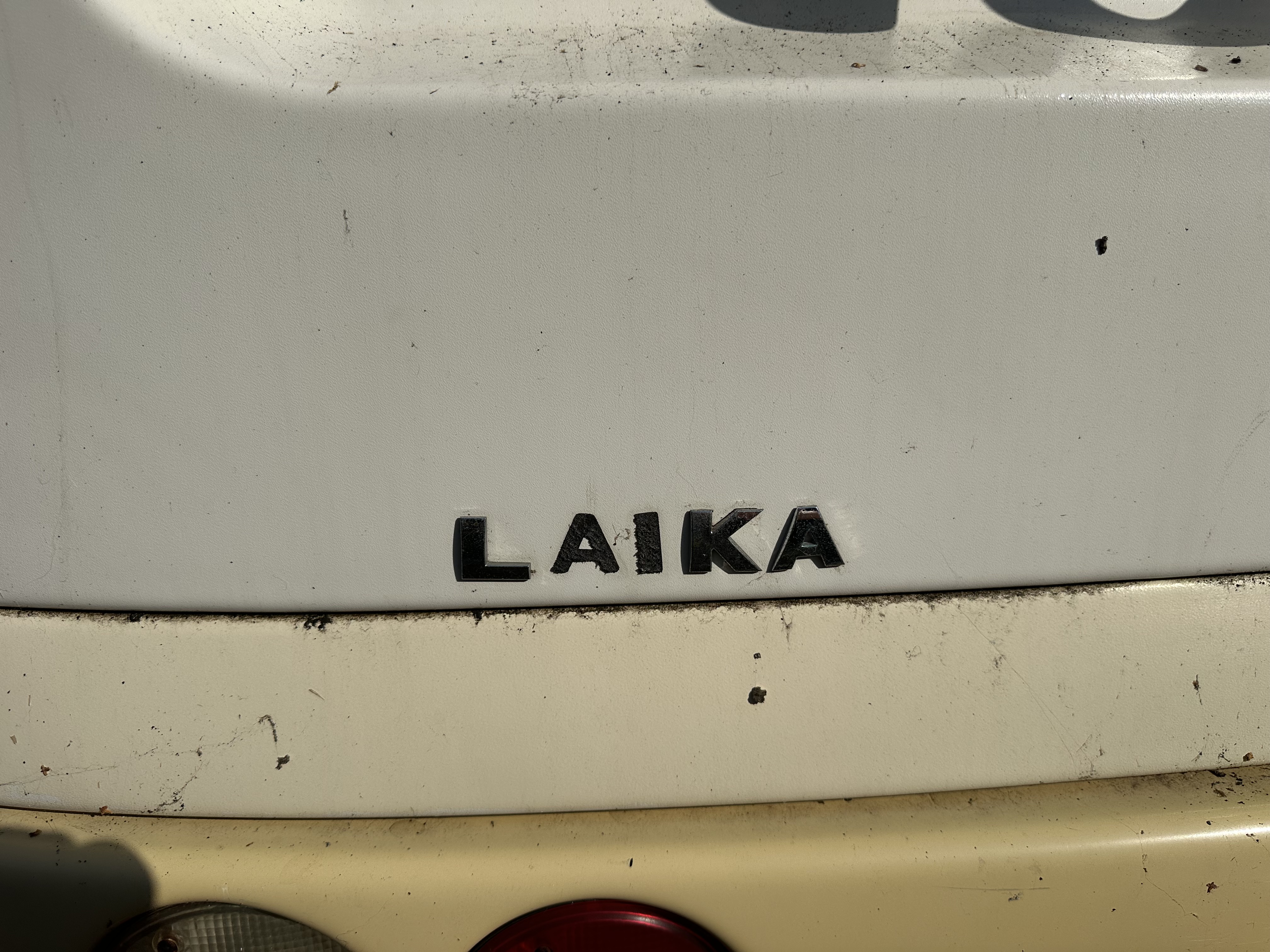
Not only did this look tatty, it did not demonstrate my pride – I guess that doesn’t make sense, but – I wanted to replace and make things look good one again.
The actual graphic / gel thing for Kreos 3010 was totally unobtanium …. But I thought, let’s replace the letters and then get some that we could replace the original gel graphic with. The letters came from Amazon and cost around 30 quid – the price depends on how many you buy. I will be honest, I winged it on size; I went for Large, as many ladies have gleefully told me that size does actually matter…. Once the letters had arrived, it was time to clean off the old bits and pieces. The gel just peeled off and left a fair amount of detritus and residue – from the looks of it, the lettering had been baked into silver foil – either way it looked like my ex mother in law – rough
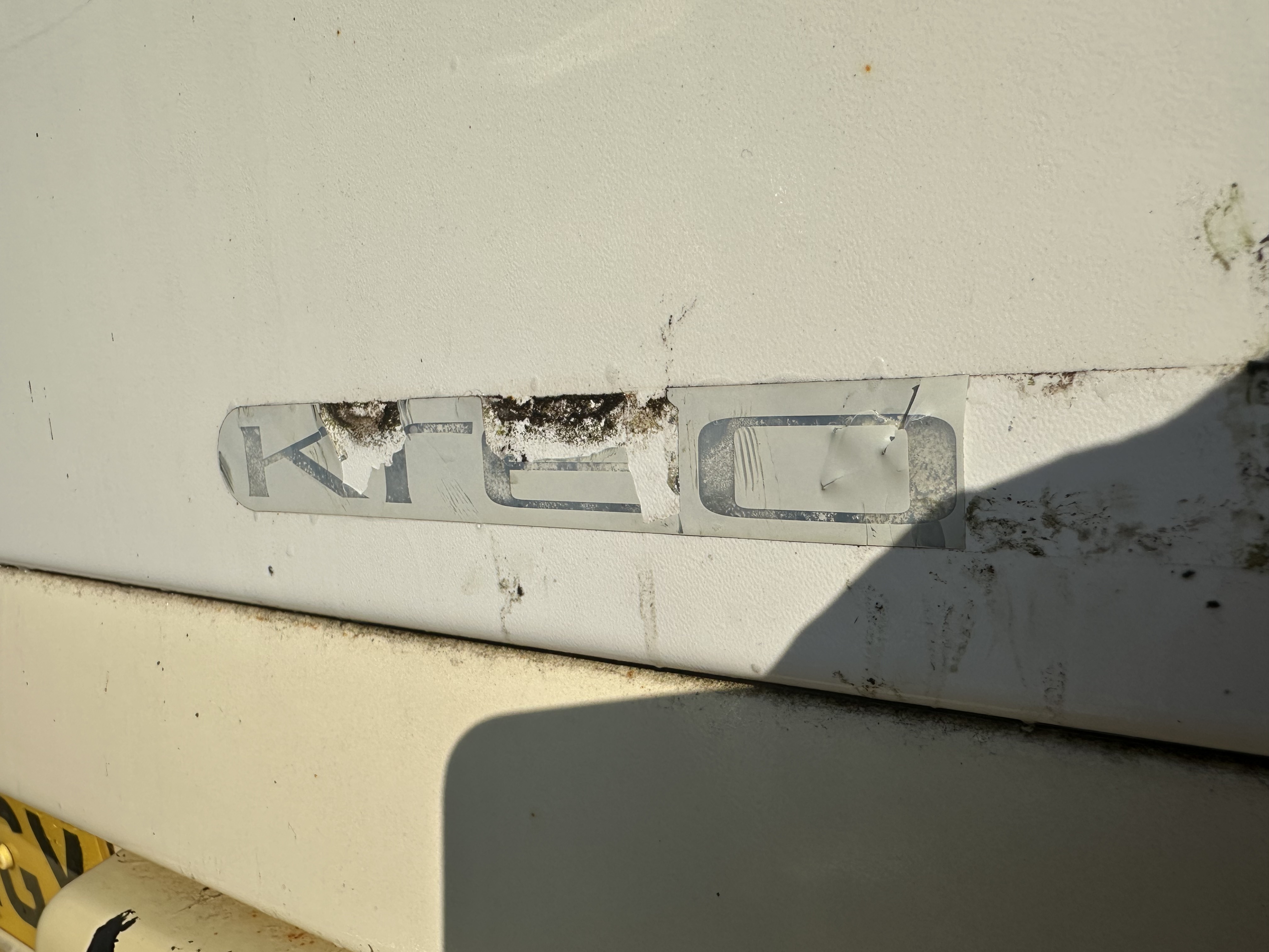
This was no actual problem to clean – start off with WD40 and a hair dryer and use a sharp blade to lift and pull the main item off and away – that will leave some glue residue.
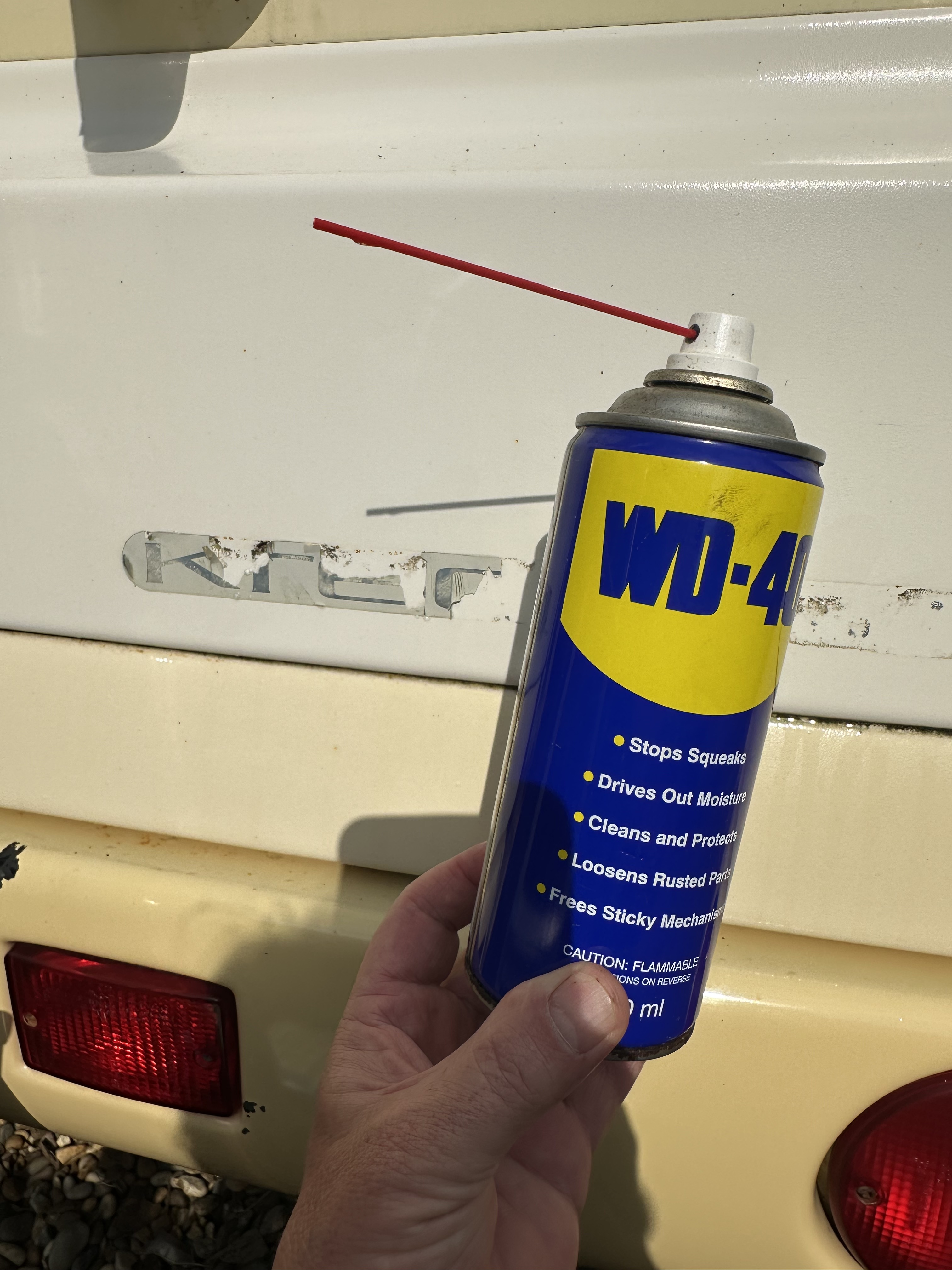
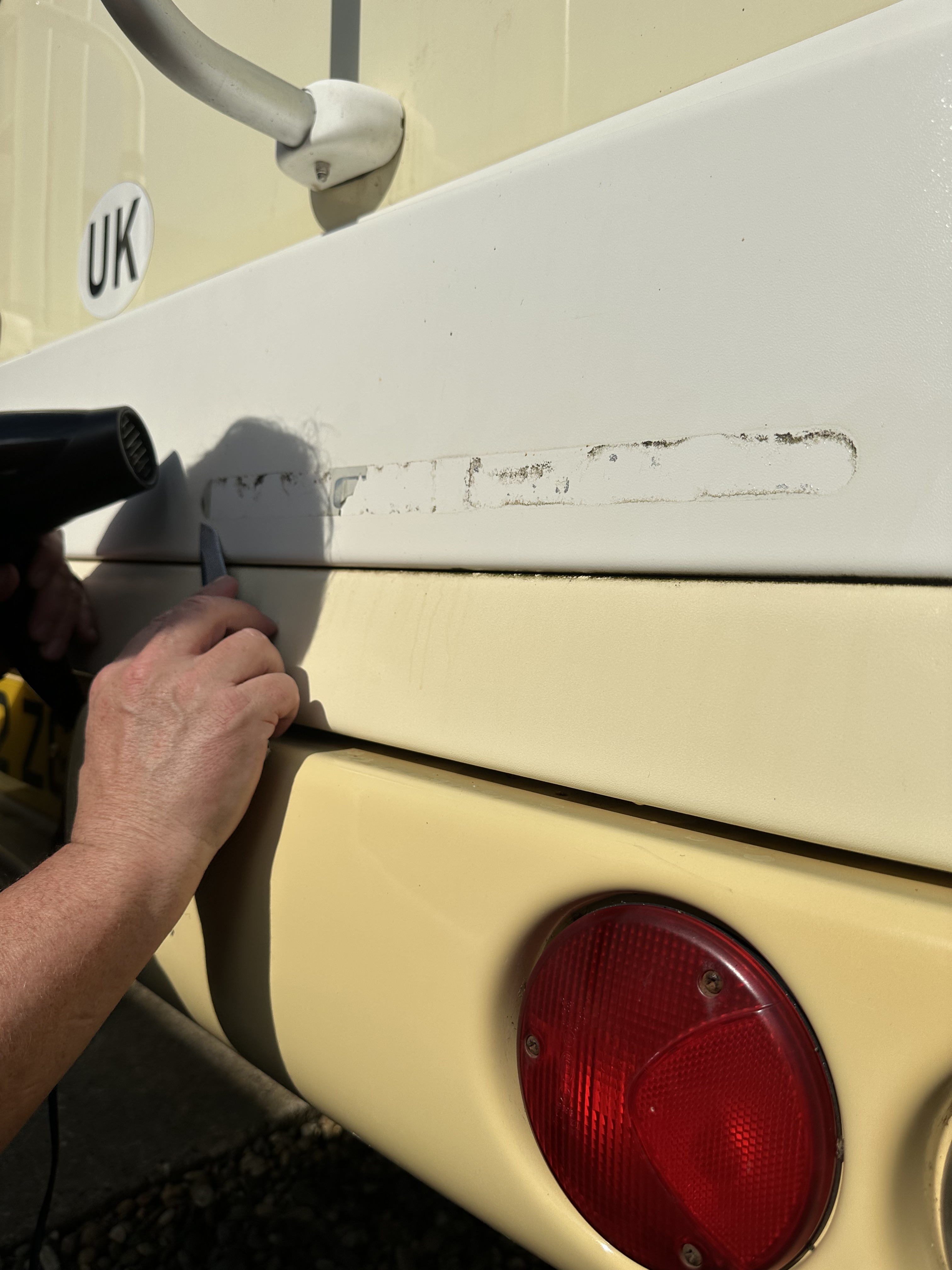
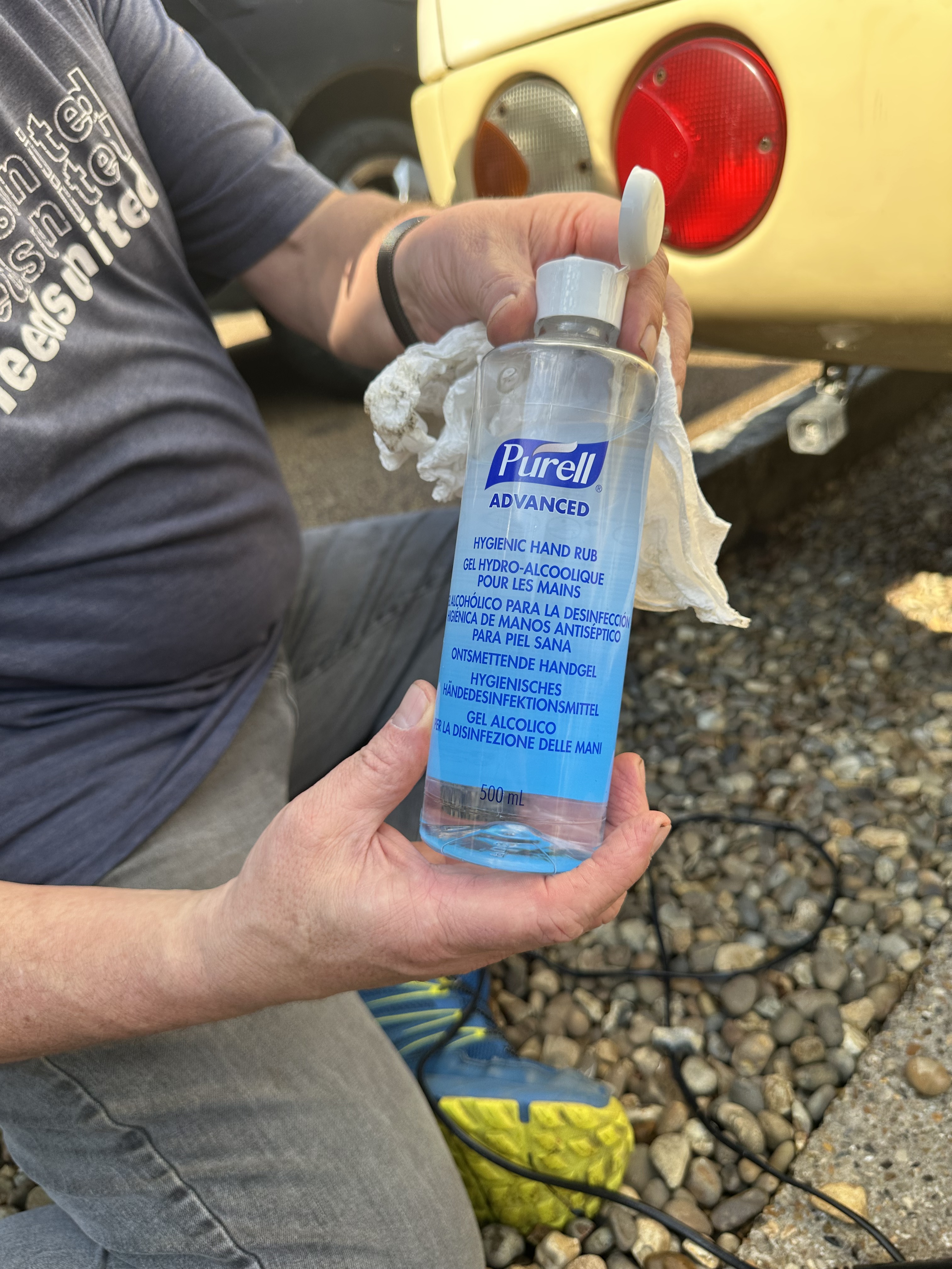
The glue residue that is left is easily removed – may suggest using isopropanalol but, I have noticed that that can remove paint and patina from our older vehicles – therefore I use a ethanol based hand gel – its not quite so rough on the base layer, and when applied with a bit of kitchen towel – works very well, leaving a smooth clean surface.
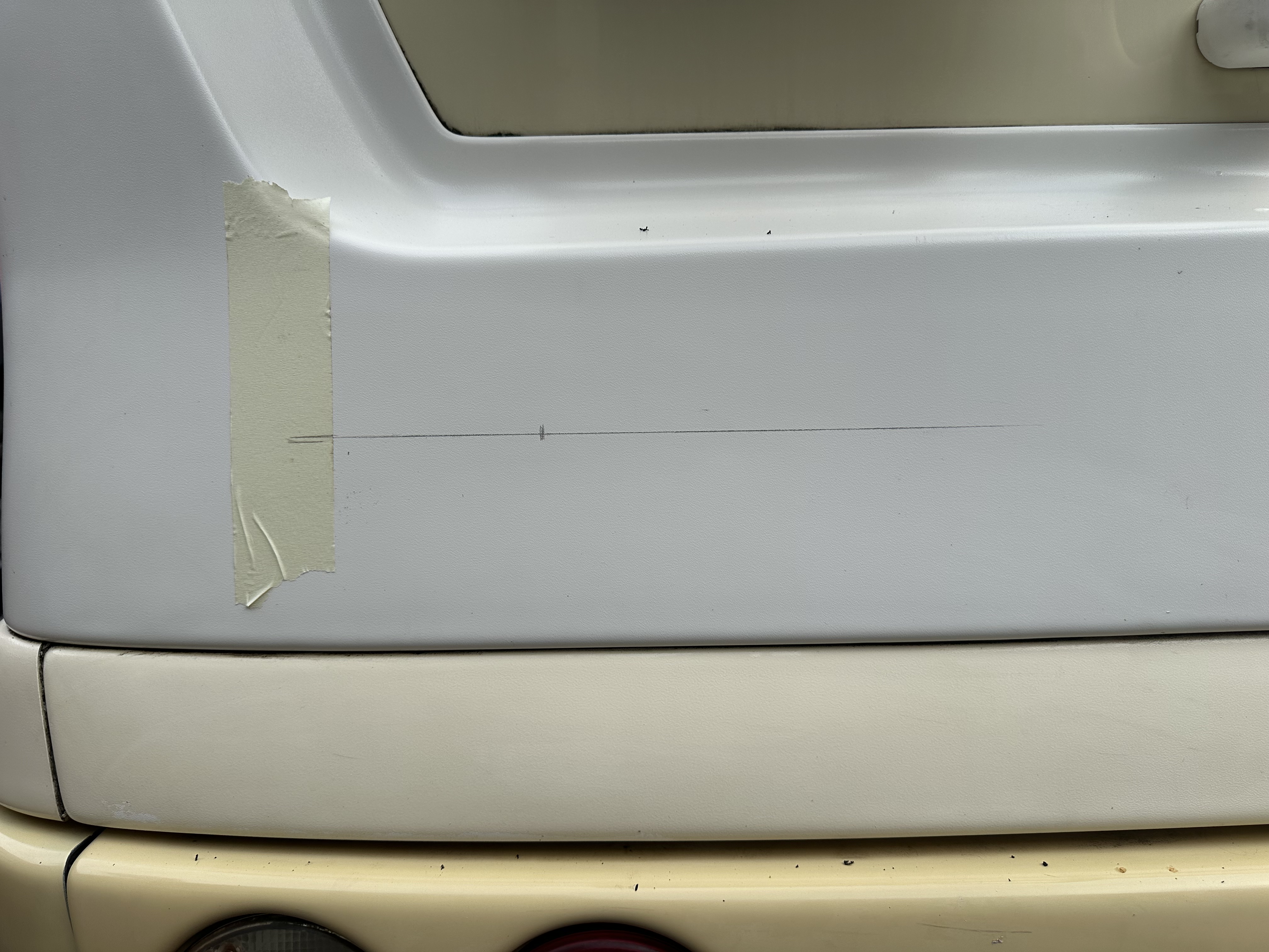
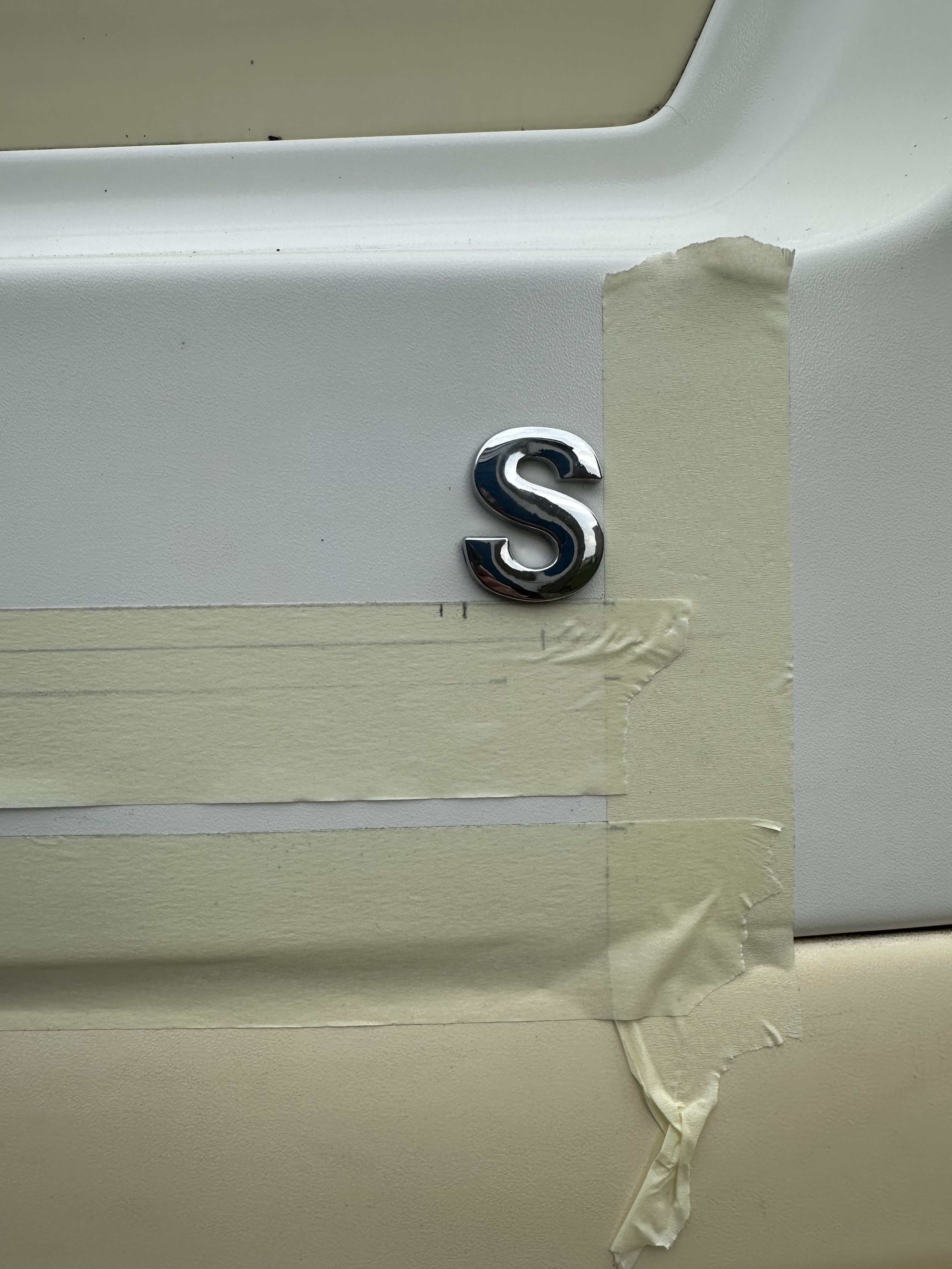
Next up was to decide on the placement, and too make it balanced – the letters were bigger, and would have looked “wrong on the original points. By eye I decided that I wanted to use the central Laika motif as an origin point – so I used a long spirit level to make my line, then used my eye to set the origin point on the left side. I drew the line in pencil initially then used a second line – literally half a letter size below – that was my base line and I used masking tape along that line as I wanted to mark a set space – just under 5mm for letter kerning.
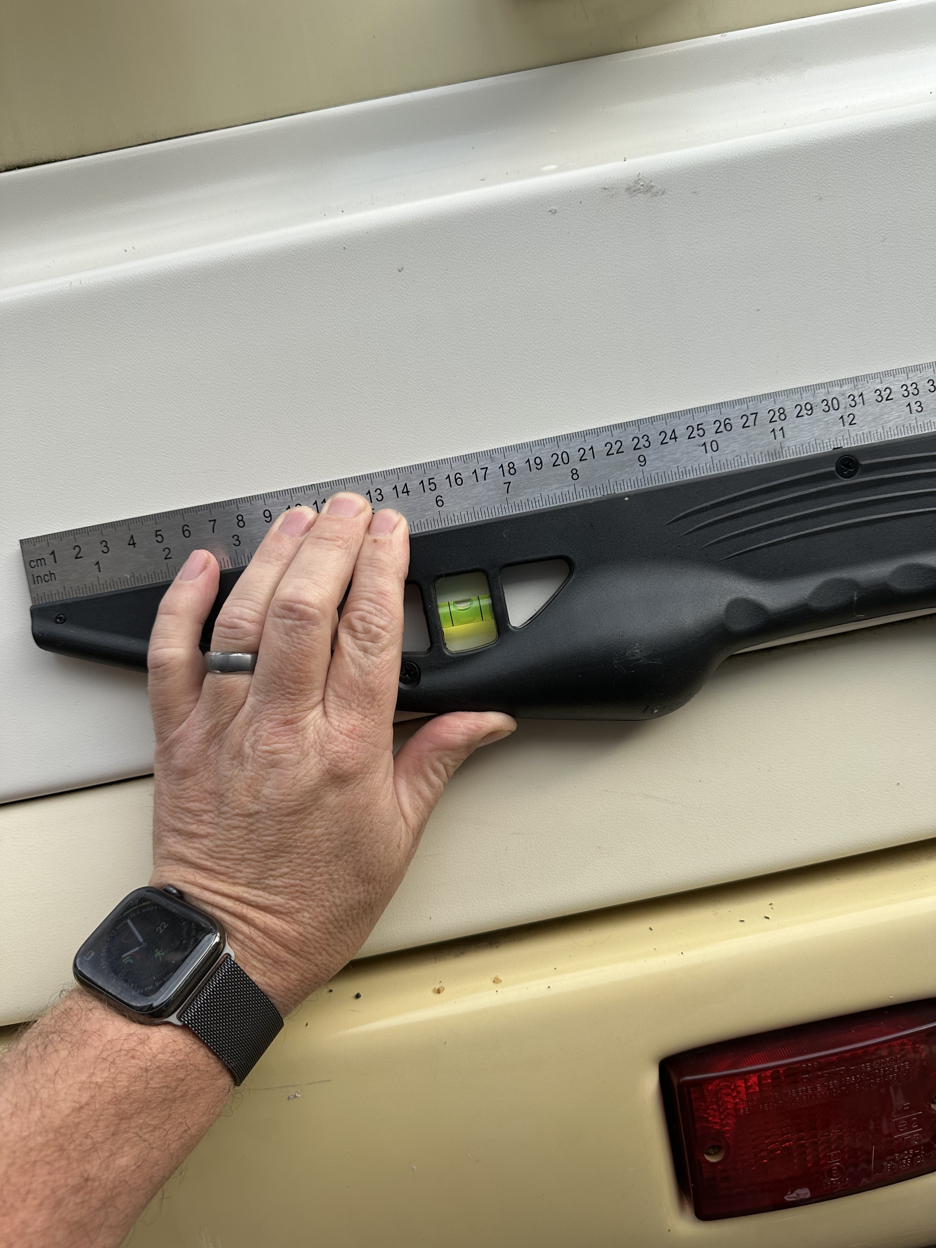
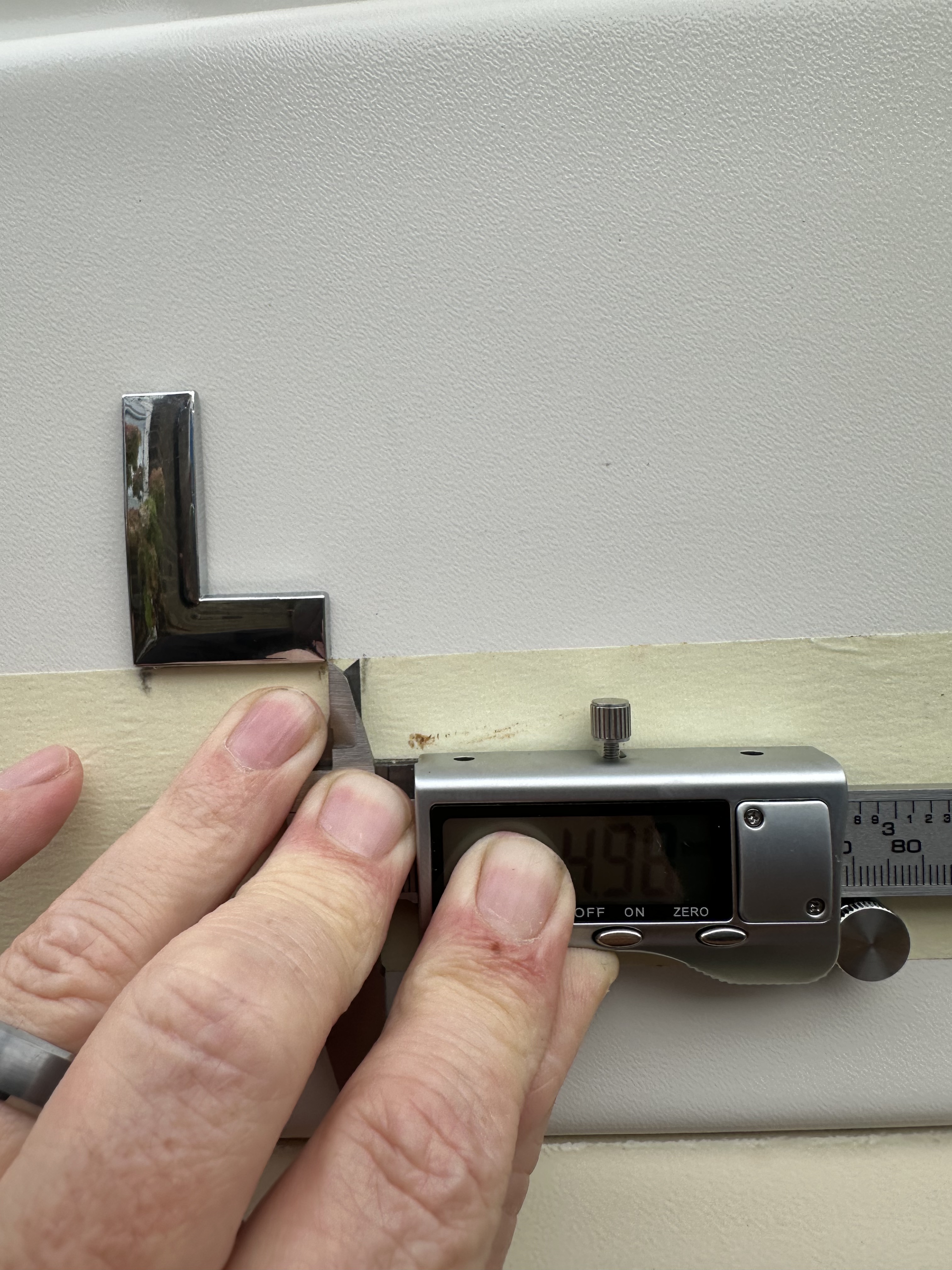
The right hand side – as it was two lines, was going to be more of a bugger – but, I used some simple maths and a touch of trigonometry – used the same central line, then dropped down by the correct amount to replicate the line kerning so it would look balanced – I also did my placement right to left, using the same measurement in from the right as the Laika placement had used – again a lot of pencil marks, and then take applied to mark and record for kerning.
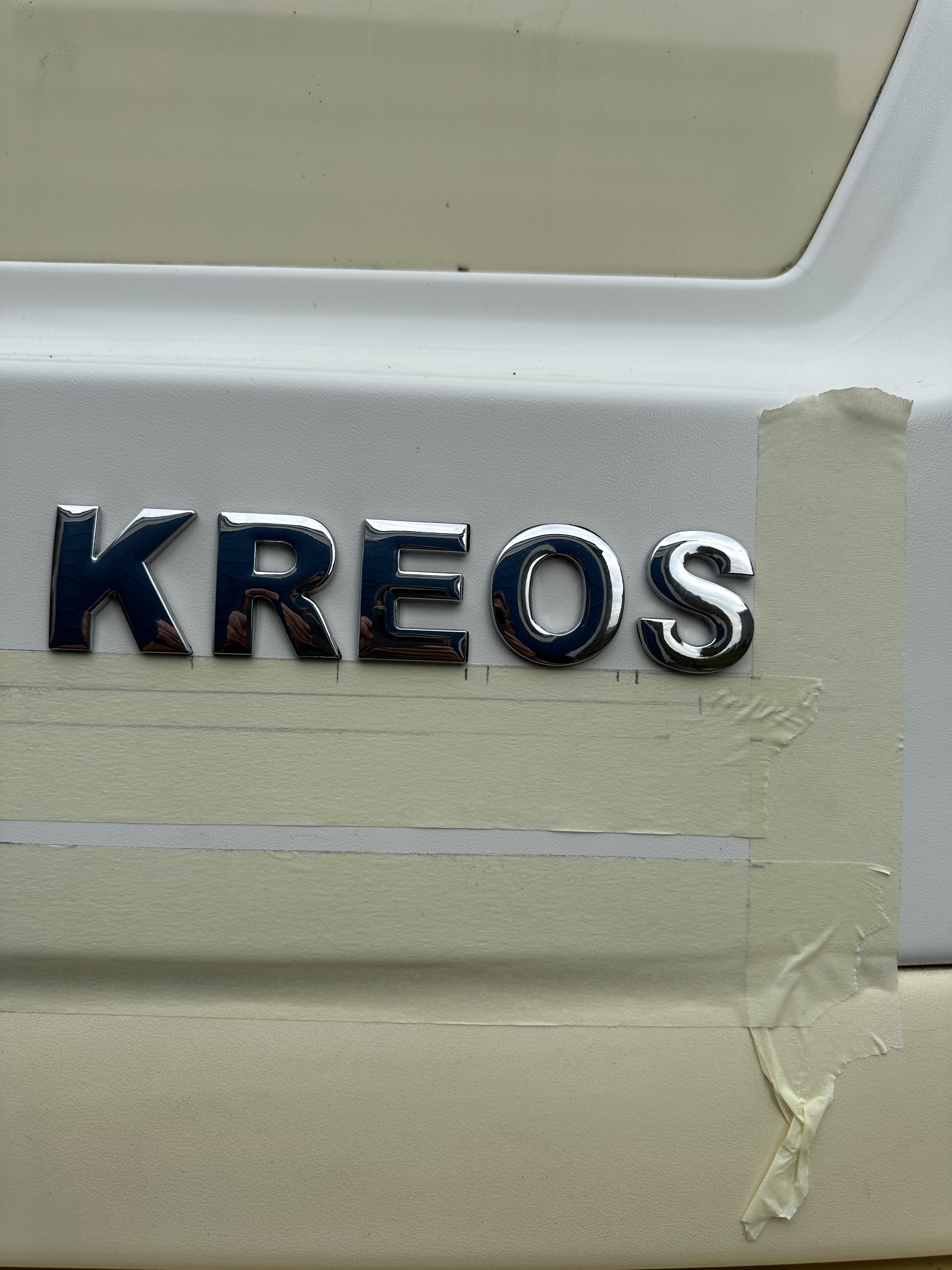
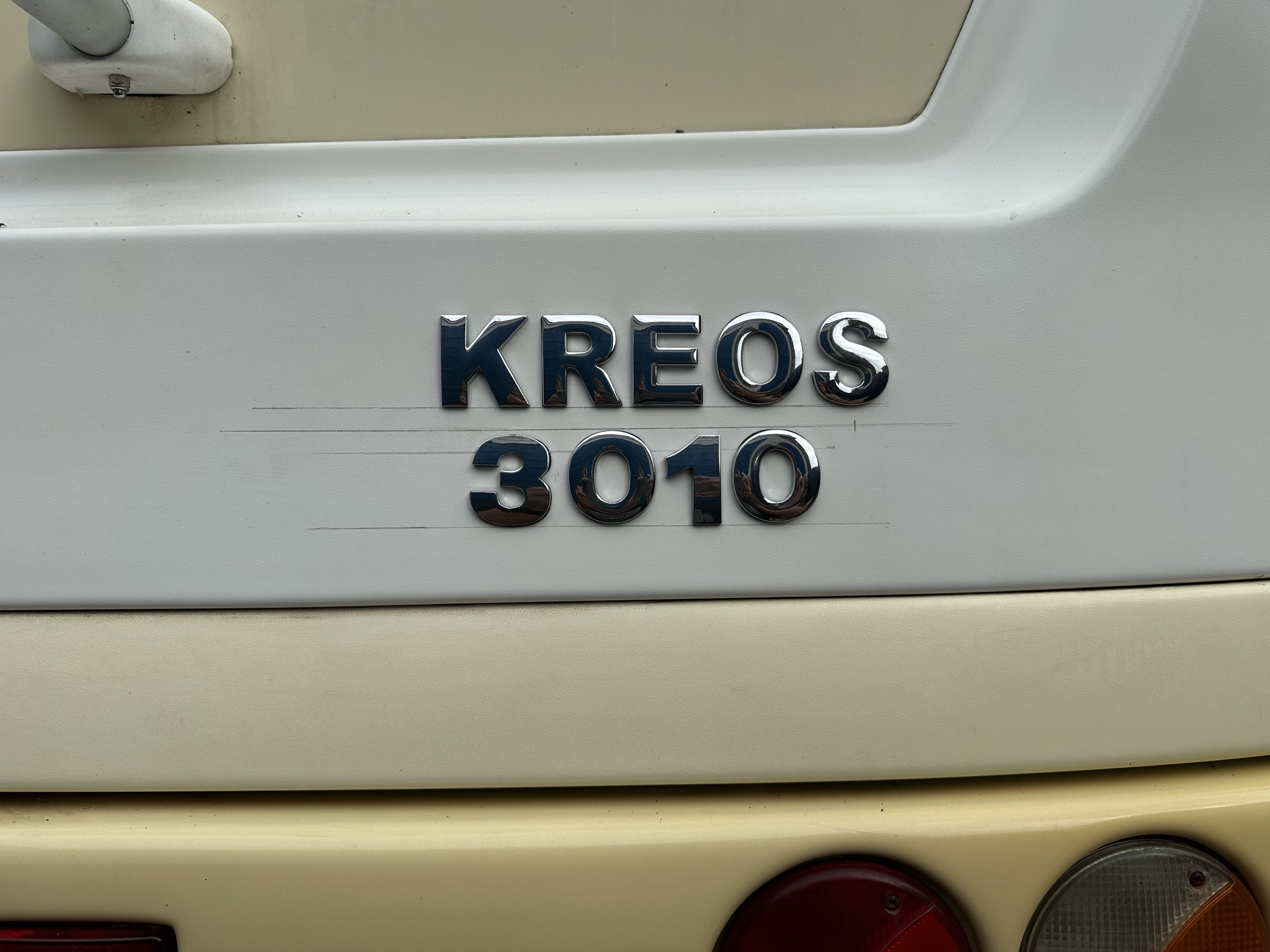
I will be honest – I am fucking pissed that the last 0 is 2mm too high but….. I then cleaned off all the pencil marks and sat back to look at it all fitted
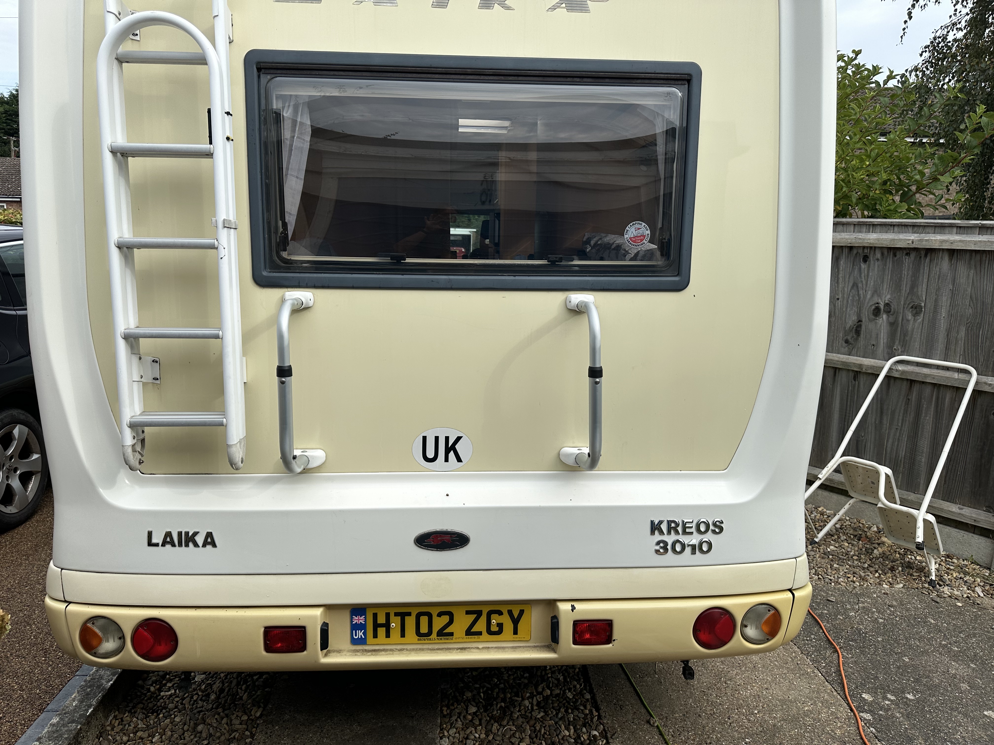
Total job took around hour or so, and was not too hard – its about confidence I guess and then wanting it to look right 🙂

Leave a comment